COVID-19 Dashboard
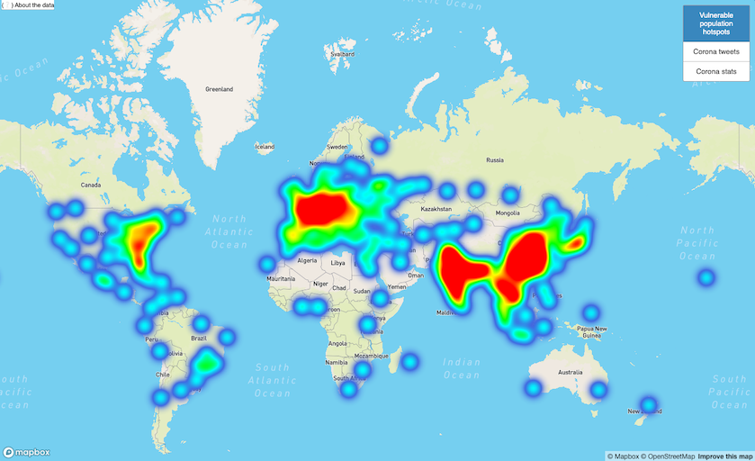
We are in the midst of a global pandemic. At the time this project started, the Corona virus was still just a headline for most - but in the meantime it reached and impacted all of our lives. Fighting such a pandemic happens in many ways on multiple scales. We are interested in how this can be done on the societal level: using data. In this project, me and my teammates built a pipeline capable of processing a large dataset and created a visualization of the areas most vulnerable to Corona which includes reported cases in real-time.
Architecture
To quickly summarize the application: a backend downloads- and processes Corona data and population data. A clustering algorithm is applied to determine the most 'vulnerable' areas to Corona outbreak. Then, all resulting insights are stored in a MongoDB database and exposes through an API. A frontend then integrates with Mapbox to show the data visually, on a map. Because we were working with large amounts of data, some sophisticated technologies were required to properly process the data:
- Apache Kafka
- Apache Spark
- Apache Zeppelin to author PySpark scripts
Brought together, this can be put in a diagram as follows:

All components are hosted on Google Cloud Platform (GCP). To also demonstrate merging both batch- and stream data in a single dashboard, also another architecture was built. This time, we took in tweets that are concerned about Corona through the keyword 'Corona' and used a Map-Reduce technique to compute the total amount of Corona-tweets sent by each country in the world. This was then again, stored in a MongoDB database and exposed as an API. See the stream processing architecture below:

To conclude both architectures and how they come together in a single application, see the following diagram:

To see the front-end in action, see the live dashboard.
Full report
For further reading, check out the GitHub repository: